系统
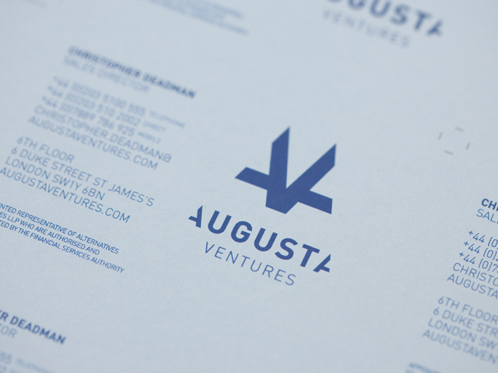
在发展中的视觉形象,我们看到居住在其名称中的字符引用历史悠久的世界,灵感来自罗马,现代主义和当代的时代。选择它的简单性和强度,使得该品牌在不断扩大和多样化竞争力的集可识别的最终成绩。System
In developing the visual identity, we looked to the historic world inhabited by the characters referenced in their name, taking inspiration from Roman, Modernist and Contemporary eras. The final mark was chosen for its simplicity and strength which makes the brand recognisable in an expanding and diverse competitive set.
奥古斯塔平衡这个词的字母'A',突出反映平等,平衡和公正的品牌故事。从外观上看,这两个抽象的'A'走到一起说话之间形成的两个“A”既代表企业直译为胜利的“V”形的合作伙伴关系,同时。加强雄厚的实力,图形的'A'形的标志和字样的锁定安排。
The word Augusta is balanced by the letter ‘A’, highlighted to reflect the brand story of equality, balance and justice. Visually, the two abstracted ‘A’s’ coming together speak of partnership whilst the ‘V’ shape formed between the two ‘A’s’ represent both the venture literally as well as victory. The lockup of the logo and the wordmark are arranged to reinforce a strong, graphic ‘A’ shape.


荣智品牌设计
转载自_设计时代


